Day 4! Let's get started!
Y-3:I dig the process Yohji Yamamoto has here. Starting from completely black, slowly gradating into colors, than going back to black basics. Elegant and smooth. We can see the a little influence of leather on the garments, but a lot of shoes are combat boots or high tops that are predominantly leather (or rubber/shiny material).The style is obviously urban and street due to its influence by Adidas, but its also a lot more stylish and high-fashion. All of the looks are generally appealing, but there aren't any specific looks that are particularly outstanding. I do love the black slanted sweater. It is a very cute top to include in your wardrobe. Very convenient for a day out.
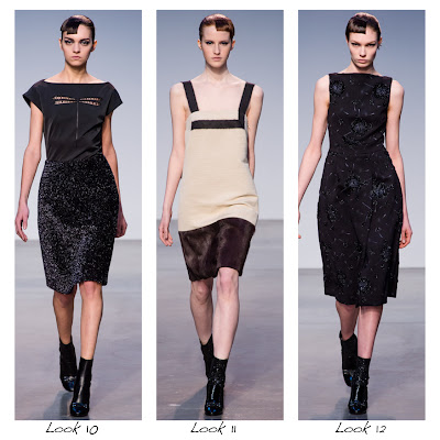
DKNY: LED screen as background? Turns out it provides a great contrast for DKNY's basic color collection. Black, White, and the beige/khaki color. This is actually very classic DKNY style. Layering is the technique DKNY employed here, and it has this 3 panel looks on most of the dress. I'm not particularly fond of the print look 6, but its still pretty awesome as a whole. I love look 11's dress, the cut is so interesting that one can immediately stand out from the crowd. This is overall a complete and well-rounded collection.
Jeremy Laing: very casual and a hint of hipster. The necklace design that goes across the entire collection definitely help unifying the collection. There are not many "common theme" that could help easily follow. Although there are some looks that I like, I am not too crazy about it in general.
Thakon: I didn't think that I would like this collection, but I end up loving it. At first glance, everything seems a bit child-like and whimsical (like Wonderland), but then as I look closer into it, I realize how smart each looks are. The net-mesh for look 2&3, the prints in look 4&5, the box-like form of the least 3 looks are all great design feats of this collection. My personal favorites are look 4 and 5. The print is gorgeous, and I love the special wrapped-like jacket on look 5.
Victoria Beckham: I love the purple. The pop of purple here and there in this collection is exquisite. The checker print on the jacket of look 1 resembles the British street style in a way. I love the wrapped round skirt in look 12 to 14. Howver, my favorite look, and the look tha tI would totally wear on a daily basis, is look 9. It has a good amount of formalness to it, a good amount of casual. It's a perfect middle ground!


No comments:
Post a Comment