Alexander Wang: What Alexander Wang is known for is the chic cuts and the empowering looks he offer women. This season, he used a lot more textures than he used to. Most dominantly is the use of furs and leathers. The medieval headpiece looks and the fuzzy shoes are pretty awesome.
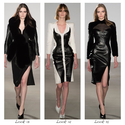
Altuzarra: Leather seems to be a predominant element in this season. In this season, the studs and buttons are also one of the major embellishment used. The cut for look 12 is so interesting that it is hard to ignore. It is very simple, but the edge that comes with the leather panels is striking. The rest of the collection is chic and impressionable and the jackets and dresses would be a great addition to any working women.
Christian Siriano: The Project Runway season 4 winner's collection has a regal features to it. I love the red curtain backdrop. It compliments the velvet and satin of the collection. The boots on Look 2 is amazing, and the skirt on look 11 is great.
Jen Kao: Leather, Geometric shapes (specifically triangles), and velvet. There aren't any specific POP for the collection, but there are some pieces that were successful in its wearability. Sweater of look 3, Skirt of look 5, Shirt of Look 6, and the coat in look 4. What I didn't appreciate was the last 3 looks we listed here. The forms were sloppy, making the model look a bit bigger than they are in the looks, along with the bizarre coloring, and the random addition of the polka dot fur, makes the show weaker than it could've been.
Jill Stuart: I'm not sure if its because of the way the clothes look like, but the models in Jill Stuart's show seems to be a bit bigger than they were. I'm not sure if that is the case, but if it is, it will say the bad cutting on Stuart's part. I would recommend the jacket on look 1, the jacket on look 8, and the dress on look 13 are all pieces that would look great on a daily basis. (For look 13, however, make sure it fits on you and take it to a tailor if its not as ideal.)
Libertine: A much more urban look than what we've seen so far with all of the crazy prints and patterns. I love the skirt on look 15 and the jacket on look 12. What I really didn't like was the last 3 looks. I mean, really? it literally looks like a bunch of scrap fabrics sewn together in a hurry because they need to fill up the collection. blek!
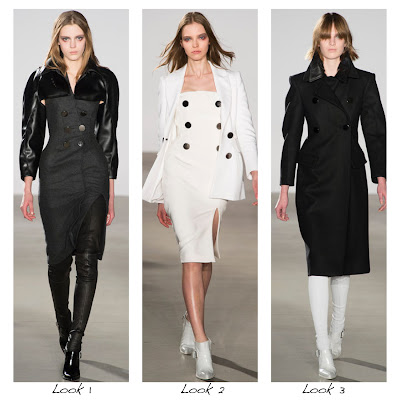
Rebecca Taylor: Adore this collection. It is so chic and simple, and the designer wasn't trying to excessively complicate it at all. There are a lot of pieces that I like in her collection, but the highlight would be the first two looks we have here. The biker jacket along with the simple white tee inside along with the unique bottoms create an edgy look that any badass downtown girl gotta have. And the beautiful dress of look 2 is so elegant and simple that would be perfect for any situation. The royal blue is also a beautiful color to contrast the black leather shoulders.
VPL: Black and white with a pop of color. I love the plum more than the red. The hidden plum bustier under the coat with a different lapel is a look, and it is inspirational for using color in such an eye-catching manner. 


No comments:
Post a Comment