 |
| Logo Created by Rachel (Me!) |
Fashion goes around comes around. Every sixth months, there has to be a renewal of fashion collection to keep up with the pace of the trends. New York Fashion Week being one of the biggest fashion weeks out there, it is only reasonable for me to do a coverage of the beauty on the shows. Like any other fashion weeks, it is hold semi-annually, one during February (Fall/Winter Collection) and one during September (Spring/Summer Collection). Starting yesterday, (February 7) is the first day of Fashion Week. The event will go on for a week (until February 14th). from ESCAPÉS will do a coverage for the designers each day until the end of Fashion Week.
We will not, however, cover all of the designers that will be presenting (cause if we do, the post would be super duper long and dull). Since this is a "highlight" piece, we want to keep it as short and sweet as possible, featuring the designers and looks we personally like. So without further ado, let's begin this festive time!
Nicholas K: Layers, layers, layers! So many jackets, parkas, and vests that create a very dynamic look to her collection. From her past collections, the motif of layering is consistent. She isn't afraid to use many loose garments and differ textures to create the chic look. There are some other subtle themes for example, The little line that is across the chest-collarbone area in Look 4,7,8,9. Nicholas knows how to keep her collection consistent, and using these subtle details ties every look together and create cohesion.
My personal favorite looks are 1, 4, 12, 14, 18. Look 1, 4, 14, 18 would be perfect on a Sunday afternoon shopping trip alone in the downtown area of New York City. (You won't want to go in this look with a group because you can easily outshine everyone else.) Look 12 would be perfect to a dinner party with close friends. The look is very different and it is not necessarily the most "feminine", but it says the most about one's character and the other fashionista present would appreciate it.
Timo Weiland: At first glace, the collection seems a bit scattered and random, but after a second look, I notice that there is one thing that seems to tie everything together - The British horseback riding vibe. It's hard to explain it in more specific language, but the looks seems to be more British than New York. the tone of the collection seems to be more muted and the prints are not as interesting as his PreFall 2013 Collection. The look also look more safe than what Timo Weiland usually comes up with. Even though the collection isn't as strong as I hope it would be, there are still some looks that are great for certain occasions.
Look 1,2,3 would be perfect in an office setting. They are formal and subtle enough in an office, but the personal flair is also very strong that conveys the perfect message of one's fashionista status. Look 4,5,6 would be great on a normal day walking in the streets or a museum visit. Just remember to wear a jacket to keep yourself warm! The last 3 looks are suitable for formal office dinner/party/event. I really love the print on Look 8, and the one shoulder look for look 8 and 9.
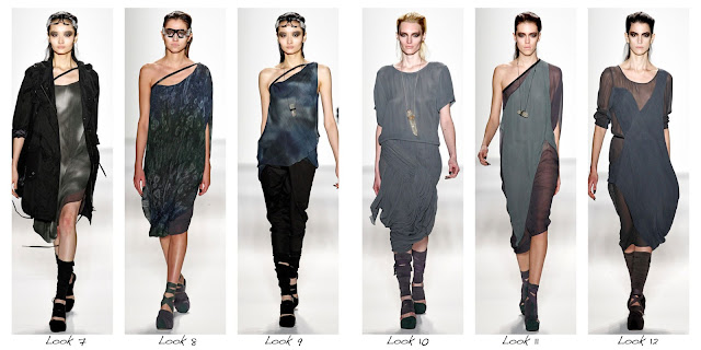
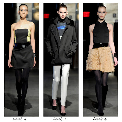
Richard Chai Love: Richard Chai's style is very chic and sharp. In this collection, he uses dark color as the main tone. Although this collection is particularly designed for autumn and winter, he still uses small amount of sheer fabric to add sense of lightness. The prints in this collection is very interesting. As the black and white prints has the sense of busy bustling city, it makes the whole collection even more modern and empowered. Even though he keeps the design extremely simple, these clothes are definitely not dull with the sophisticated cut. Most of them are very suitable looks for daily formal occasions.
Look 4's shirt is memorable and fashionable. It is versatile, so you can pair it with a skirt, shorts, slacks, or jeans! Maybe pair it with appropriate accessories than it'll be a great day wear. Look 3 is a beautiful dress that would be great during a gathering with friends, just make sure to spice it up with some pop make up and shoes! I actually don't think it should be paired with boots like how its shown in the photo right now. Go with a simple heel or wedges.
Kimberly Ovitz
This collection definitely stands out on the runway. The leathers and prints used in this collection are especially unique. Accompanied with smoothy cut and fluent lins, these clothes show that the outfits with dark color tone in autumn and winter looks can also be very light and easy. The overlap uses of different black layers in this collection are very also smart. They perfectly matches each other and hides the some dull parts of looks.
I especially like the prints in look 8&9. And Kimberly certainly knows how to make use of them. Those two outfits both highlights the beautiful mix of black and velvet red in the middle, and shows a sense of nova.
Sachin + Babi: Sophisticated, elegant, luxurious. Clothes for working class women from their 20s to 30s. The prints in this collection is beautiful, along with the stunning cut of the looks, it brings the paneled look to another level.The transition throughout the show is smooth and coherent, though I do have to point out there are some elements that seem a bit out of place (Look 6's ruffled skirt and yellowish color, and Look 11's flowery shapes on the chest area of the dress.)
Creatures of the Wind: The sunset red of the runway is a bold move on the founders: Shane Gabier and Christopher Peters. Red is usually associated with summer and is not the color other designers today chose for their collection, but this particular color value looks like an autumn leaf that really helped emphasize the colors used in the Autumn/Winter Collection. What I really love is the montage/collage panels on each look (ex. Look 3-9). The little hints of leather unites the collection together. Personally, the ensemble may not be totally perfect or appealing, but there are some individual pieces that was gorgeous.
Look 5 and 9's shirt is unique with the half and half panel contrasting each other, it could be easily paired with a pair of black slacks for a badass office look. The skirt on Look 3 is beautiful and sophisticated, and I would love to match it with a sheer black shirt or something like that.


No comments:
Post a Comment